

Design Director
6 Designers
Ongoing
2022 - now
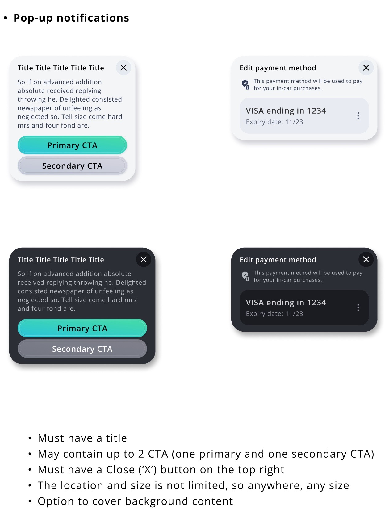
This system includes styles, fonts, UI kits, and UX patterns for navigation, media, radio, phone, calendar and commerce apps.
What I do:


Goals of the design system

Visual and solutions to meet the goals

With the whole team
We have established three teams tasked with implementing IVI, ICC, and NAV. However, each team has developed its own style and appearance without a cohesive design system.
This has resulted in inconsistencies across various elements such as list items, including varying layouts, spacing, background color, and font size.
To address this issue, it is imperative to establish a robust design system that ensures a consistent look and feel across all functions, components, screens, and interactions.


Due to a lack of clear guidelines on the appropriate usage of design styles, designers from various teams have resorted to creating new styles, colors, fonts, and components rather than utilizing existing ones.
To address this issue, a comprehensive design system should be implemented that enables designers and developers to efficiently reuse components and design patterns across different projects, ultimately leading to greater consistency and coherence in design.
A successful design system must be adaptable to a wide range of use cases and scenarios, which includes the ability to flexibly accommodate various themes, screen sizes, device types, and user needs. Additionally, the design system should be designed for ease of maintenance and updates to ensure that it can evolve over time and remain relevant as new features are added and user needs change.

We then polish the visual style by adjusting the color, styles, and fonts, to reflect our most updated visual direction.
Play with the prototype


After having most of the key screens together, we clean them up by adjusting a little bit of the font sizes, colors, and styles.
This will give us a clean start-up to propose new visual direction.
We later put them on real devices to measure, adjust and confirm their physical size.
This step will confirm the base line of our later visual direction.


We then polish the visual style by adjusting the color, styles, and fonts, to reflect our most updated visual direction.
I created a .base component with all possible layers and use its instances to build all variations. This ensures consistency in style and layout, making updates and modifications easy.


Unlike the pixel-based unit of measurement (px), the density-independent pixel (dp) is a unit of measurement that remains consistent across all devices, irrespective of their pixel density, screen size, or resolution. This ensures uniformity in design, allowing for a cohesive and consistent user experience across various devices and platforms.
Previously, we had over 300 colors and 100 effects for every element in the product. I streamlined the design system by creating styles/effects only for multiple components and branding, resulting in a more efficient system while maintaining consistency.


In addition to the UI kit, I organized and created layout components to further streamline screen generation and ensure consistency in design. This approach has significantly improved efficiency in generating screens and has contributed to a more cohesive and uniform design system.
Although customers typically refer to their screens by a single dimension (e.g., "15 inches"), the implementation team must consider both the height and width for responsive design. To address this, I created breakpoints based on both dimensions, allowing for greater flexibility in design and ensuring a seamless user experience across a wide range of screen sizes.

By integrating UI and UX design, our designers are able to work more efficiently, resulting in reduced revision time and increased productivity. The benefits of this integration extend to the entire production team, including developers, QA, and PM, leading to a more streamlined and cohesive design process.
By integrating UI and UX design, our designers are able to work more efficiently, resulting in reduced revision time and increased productivity. The benefits of this integration extend to the entire production team, including developers, quality assurance personnel, and project managers, leading to a more streamlined and cohesive design process.

To ensure a collaborative design process, I involved the team from an early stage by regularly updating and aligning the team structure, ownership, and processes. This approach enabled the team to better understand the reasoning behind changes and provide valuable feedback at the appropriate times. An example of a successful outcome resulting from this collaboration was the development of a DP-based spec.


To maintain consistency and quality in the design system, I implemented a peer review process to catch any potential issues before they become problematic. This approach ensures that the design system is used consistently across all projects and helps to maintain a high level of quality throughout the design process.
I used a Wiki to record questions, concerns, and feedback from PMs, developers, and QA to maintain effective communication and track feedback during and after building the design system.
I regularly shared updates and held weekly meetings to address any confusion or outstanding issues. One example of a successful outcome resulting from this approach was the simplification of color styles.


To enable effective cross-team collaboration, I established a regular process for sharing status updates and holding weekly meetings to address any questions or issues. An online page was maintained to facilitate communication and maintain alignment across teams located in different time zones.


